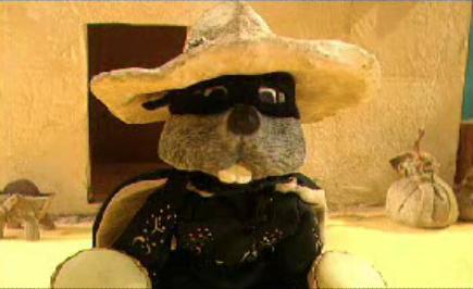
We're doing a Cadburys brief at uni and I can't help but think of this from my childhood. It's the best opening titles sequence EVER in my opinion. That of which may be influence by my intense hunger right now having not eaten anything today and the face I've been staring at chocolate pictures all day!

Friday, 26 April 2013
Wednesday, 24 April 2013
Advertising Strategies
The Volkswagen 'Drive Carefully' Campaign


I think the strategy here is, trying to communicate the importance of safe driving, through the use whit and through not using typical, 'over used' shock techniques. Using instances in life we can all identify with. If I go deeper into it I think the target audience are parent or at least people in their 30's & 40's who have some connection to children, because they've used accidents children have that will appeal to the parents emotions. I look at these and think they are slightly humorous which doesn't make me want to drive safely but I think a parent will look at this and their heart will go out to the child thinking of how they could have prevented such an accident. It's very cleaver and that it probably why it won in the D&Ad awards in 2012.
Credits: The Drive Safely campaign was developed at DDB Argentina, Buenos Aires, by executive creative directors Hernán Jáuregui and Pablo Batlle, creative directors Fernando Tchechenistky and Lisandro Grandal, art director Alejandro Hara, copywriter Emilio Yacón, and account manager Cecilia King.
Tuesday, 16 April 2013
ITAP - My Design Hero - Philippe Starck.

My chosen design hero is Philippe Starck, the inspirational French product designer. You can find my presentation link below.
Click here to view my presentation.
Monday, 25 March 2013
ITAP - Steph Parker - Design Heroes: Alfred Leete.
Alfred Leete, a British Graphic Artist, famous for the image below, was an illustrator from a young age, having had a cartoon published at age 16. He then worked in a printers workshop before going on to do his own work. I do not really like this image that much, I think it's lacking boldness and colour. The man looks very condescending and i feel as though i'm being told to do something I dont want to do rather than being motivated into action. I think the text is a little too illegible for a poster design, for a poster i think the whole message needs to be legible rather than just one word. Finally I think the positioning is not aligned correctly. I do not like how the arm is cropped and the face looks a little off centre to me.

I prefer the work Leete did for the London Underground back in the early 1900's I think they're very cleaver and the style in wich they have been done is one that I particularly like. The reliance on wit and humour is what makes these adverts. I don't know whether he was the writer for these ads but he certainly has designed for the text with great care and sensitivity to the message.


The war poster design was copied in 1917 by the American artist James Montgomery Flagg for the US army and I think it's a better version for a number of reasons. Firstly I think the colour makes it much more eye catching and somewhat more believable. The colours also are more patriotic, it's mainly red white and blue, so this may subconsciously evoke patriotism in the viewers. I think the position of the subject is a more personal one, by that I mean it doesn't look as much as the other one that he is looking down his nose at you and pointing as you, he is more staring at you into your eyes and asking you rather than telling you. The YOU being in red also highlights the personal aspect of this image. It makes it about me the viewer.

Friday, 15 March 2013
ITAP - Design Heroes: Tim Allen.
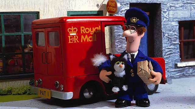
Tim Allen himself gave this lecture as we joined the animation students to hear him talk of how he got started in the animation business and some highs and some lows of working in the industry. It was very interesting to hear what he had to say about working professionally and the pressures that are put on you as an animator. Tim works solely in the field of stop motion animation, an area I am fairly interested in, it was great to listen to the man who was the main animator on some of my favourite kids TV shows. El Nombre, Fireman Sam, Postman Pat


My personal favourite claymation TV show on earth is Creature Comforts which Tim Allen worked on too! I love the accuracy of the human characteristics portrayed through the clay animals and often with hilarious audio recordings the animation compliments and enhances them excellently!

Tim gave us some good advice during the talk,
- Keep a record of all your work.
He said this so that you always have a record of where you have come from, the progression of your work and your style. Also you have a good bank of work to show agencies and clients when trying to secure a job.
- By 'just doing it', you gain experience and have a lot of opportunity to practice and inevitably you get better.
I wholeheartedly agree with this one, the more you do the better you get at doing. Practice makes perfect. There are loads of cliche phrases for a reason, it's the truth. The more i practice drawing and freehand typography the better i become at it!
- When putting together a showreel (we can translate this to portfolio) put your best work at the begging to grab their attention and then your best at the end, to leave them with a good feeling at the end, wanting more.
This is obviously a very helpful tip, i will have to find out weather it is true for graphic portfolios too but I think it sounds like a pretty sound piece of advice.
From Tim's talk I gained knowledge of a different field which is always useful, I was inspired to get out there and just DO more. He gave me a down-to-earth insight into what the real creative world is like and it was very refreshing to hear.
Tuesday, 12 March 2013
ITAP - David Osbaldestin - Design Heroes: SO ME
David Osbaldestin gave a great talk talking about the links between fine art and design and he spoke of over 10 of his design heroes. The first designer he spoke about was the one he focused on more.
SO ME, real name Bertrand Lagros de Langeron, a french designer and animator who is also the art director for Ed Banger Records. Bertand is a self confessed part animal, he says that has best ideas come when hungover or on the road "so partying abroad is perfect" for him he told Surface to Air in a 2012 interview. Although from a Graphic Design background he spends most time in film making now, having made music videos for Kanye West, Kid Cudi, Justice, DJ Mehdi and MGMT. He also directs music videos and recently directed the music video for the 'Duck Sauce' song, "Barbra Streisand".
SO ME's video for the french electro duo Justice, friends of so me, incorporates hand drawn type that has links to Vernacular Typography (Lettering in the urban environment) the verity of type design is impressive and the composition on some of the T-shirts with more text is great. Here are some examples of Vernacular Type that remind me of SO ME's work.


I had a go at one of my own type designs using my initials. And in the process I learnt that it's not as easy as it looks to get it exactly right. I'm not very happy with this rushed attempt and I think I would have to do more by hand with pen and paper rather than simply using illustrator.

This video was a huge success and possibly landed him the job to do Kanye West's "Good Life" video after SO ME got his attention by creating this spoof cover of the artwork of the song that beat Kanye at the EMA awards when Kanye stormed the stage declaring that his video cost $1,000,000.

SO ME, real name Bertrand Lagros de Langeron, a french designer and animator who is also the art director for Ed Banger Records. Bertand is a self confessed part animal, he says that has best ideas come when hungover or on the road "so partying abroad is perfect" for him he told Surface to Air in a 2012 interview. Although from a Graphic Design background he spends most time in film making now, having made music videos for Kanye West, Kid Cudi, Justice, DJ Mehdi and MGMT. He also directs music videos and recently directed the music video for the 'Duck Sauce' song, "Barbra Streisand".
SO ME's video for the french electro duo Justice, friends of so me, incorporates hand drawn type that has links to Vernacular Typography (Lettering in the urban environment) the verity of type design is impressive and the composition on some of the T-shirts with more text is great. Here are some examples of Vernacular Type that remind me of SO ME's work.
(these 4 images are taken from http://vernaculartypography.com/)

This video was a huge success and possibly landed him the job to do Kanye West's "Good Life" video after SO ME got his attention by creating this spoof cover of the artwork of the song that beat Kanye at the EMA awards when Kanye stormed the stage declaring that his video cost $1,000,000.
http://www.bbc.co.uk/collective/dnaimages/gallery/2/edbanger/2.jpg
These kind of bold acts are those that get you noticed and get you recognition along side good work. We can learn from SO ME here, his ability to respond so quickly to an event like this is great.
Sunday, 10 March 2013
ITAP - Ranveer Nandra - Design Heroes: Peter Chung.
http://www.rubberslug.com/img_show.aspx?ImageID=316046&X=530&Section=Item
Here an original drawing of Aeon Flux by Peter Chung to one of his adoring fans at Comic-Con in 2005.
Peter Chung is a Korean American animator who is most famous for his creation, Aeon Flux which featured on MTV's Liquid Television and then aired as it's own 30 minute episode series. He is a man who was tired of the boundries/templates/rules set by Walt Disney and by Anime and Manga animation, so he broke those rules. And as far as examples of people who broke the rules go, this guy b r o k e the rules! Watch this.
He broke traditional animation styles, in the way this was animated but also in the plot lines, the dialogue or lack of it as the case may be here. He broke traditional methods of telling stories, Aeon Flux would die at the end of each episode for example, completely challenging the typical 'serial style' used in popular tv and film.
Compared to his other work on the Rugrats where he felt constrained buy the characters but also by the boundaries set in place by Nickelodeon and the standards of kids tv shows of the day. Some would say that Rugrats was quite an 'on the edge' childrens cartoon and there actually many theories about the show's hidden storylines, one being that there are no babies and they're all in Angelica's imagination they infact where all meant to have died at birth or in vitro and this is meant to explain the parents behaviour and also why Angelica can speak to both the babies and adults. I think that is going a bit far, but I think some of these theories are plausable because of Peter Chungs style of animation being quite quirky.
By watching the Rugrats however, you can see how Chung was trapped in a babies world with his animation and in an interview he expressed that his desire was to create athletic characters with long limbs. He wanted to create something that was super sexy and super cool and he certainly did that whilst blowing the rules out the water.
Sunday, 3 March 2013
ITAP - Colette Jeffreys - Design Heroes: Otto Neurath
Colette gave us a very broad and extensive talk about the subkect of Information Design, talking about a broad number of people however I am going to talk about one of those names. Otto Neurath, one could say that he is the founder of information design, he certainly is the founder of the Isotype System and undoubtedly one of the key figures in the history of information design.
Otto Neurath, born in Austria in 1882, died in England in 1945 sadly seeing non of his work come to completion. His work was continued on after he died by Marie Neurath, his 2nd wife who later died in the 1980's having completed and published Otto's work and herself written many children's books using the Isotype system.
Otto Neurath, born in Austria in 1882, died in England in 1945 sadly seeing non of his work come to completion. His work was continued on after he died by Marie Neurath, his 2nd wife who later died in the 1980's having completed and published Otto's work and herself written many children's books using the Isotype system.
It is the International System Of TYpographic Picture Education. It's the idea of communication without words. It's a global language using symbols and pictures to speak and communicate with people. Let's take a look at some of his work. I'm going to jump straign into a very specific example of Neurath's work, I get the sense that it has a style but it's done completely for information purposes. It's as if the style isn't as important as the actual fact, figures, processes, stats etc.

http://www.humantific.com/wp-content/uploads/2011/11/image_04-450x600.jpg

http://www.humantific.com/wp-content/uploads/2011/11/image_02-450x600.jpg
Here Otto is displaying information about the production of plastics and their properties, sounds like a boring science lesson to me but when you look at it it's strangely inviting and you find yourself wanting to learn wanting to see what the plastics are made from. I think this is for a few reasons.
1 - Curiosity. You want to see what symbols have been used to represent each element. This hooks you in
2 - Simplicity. It's designed in such a simple way that you don't feel bombarded with scientific nonsense, it's clear and concise, so you're not put off.
3 - Use of shape and colour. Your eye follows the process through cleaver use of arrows and shapes that flow into each other and through cleaver use of colour that again makes it simple to follow.

I had a go at creating my own in the same style. It requires a lot of skill to use the right kind of symbols. Hence a near lifetime spent working on such symbols.
Saturday, 2 March 2013
ITAP - Ros Sinclair - Design Heroes: Sir John Hegarty & Juan Cabral
Ros spoke about many different designers and art directors but I have chosen to blog about two, Sir John Hegarty & Juan Cabral as it was their work that stood out to me the most and I was interested in comparing the old and the new.
Sir John Hegarty
 This man has been in the business of advertising since the 60's. He is a firm believer of being a specialist in your particular field and he's a believer of reductionism. Reductionism is where you strip an idea to it's bare bones whilst staying succinct and to the point.
I particularly admire his work for the launch of black Levis in 1982, it is a perfect example of Hegarty's Reductionism theory. It was a very bold decision to go with such a simple poster design but the idea behind it is so strong and Levis obviously wanted the bold statement of being different and not going with the crowd to represent their now product launch. You can agree that over 20 years later this is still a good advertisement, the idea still stands strong!

Juan Cabral - famously used Jose Gonzales, "Heartbeats" for the sony bravia 'colour' advert to it's glorious success.
This ad is so beautiful, when I first saw it I was in the cinema about to watch a film and I was utterly captivated and mesmerised by the stunning images that were before me. It hooks you to believing anything they tell you, "this TV has the best colour", "this TV uses alien spaceship technology". I would buy it; "because of the trance like state you have just lulled me into you can say thing you want to me and i'll buy it!". It's no secret that this advert heavily relies on it's music, if it was silent it would still be beautiful but the music engages your soul and spirit into it, as music has that unique capability.
Similarly this advery of Juan's also relies heavily on music and it really does contribute masses to the overall success of the advert.
So what do we take from this? As designers, visual communicators you could take this information about music making 50% of an advert as bad news however I think we can use it to our advantage. It provides us with a new challenge, to create images/visuals that compliment, enhance or even outshine the music in an advert, it's more of an art to be able to create a perfect relationship between sound and image and I think Juan has this skill within his grasp and we too can aspire to attain such skills.
Sir John Hegarty
I particularly admire his work for the launch of black Levis in 1982, it is a perfect example of Hegarty's Reductionism theory. It was a very bold decision to go with such a simple poster design but the idea behind it is so strong and Levis obviously wanted the bold statement of being different and not going with the crowd to represent their now product launch. You can agree that over 20 years later this is still a good advertisement, the idea still stands strong!
http://thegalleryfromoverthere.files.wordpress.com/2012/10/when-the-world-zigs-zag.png
"Music is 50% of advertising."
Hegarty was a big believer in music in advertising. Many of Hegarty's commercials would put songs in the charts and often right to the top. Which reminds me of the Windows Internet Explorer 9 advert with the Alex Clare's song, "Too Close" that went into the top 10 in both the UK and US charts and went double platinum all from the advert the aired the song a month early to it's release. This brings me nicely onto the 2nd design hero of this blogpost.
Juan Cabral - famously used Jose Gonzales, "Heartbeats" for the sony bravia 'colour' advert to it's glorious success.
This ad is so beautiful, when I first saw it I was in the cinema about to watch a film and I was utterly captivated and mesmerised by the stunning images that were before me. It hooks you to believing anything they tell you, "this TV has the best colour", "this TV uses alien spaceship technology". I would buy it; "because of the trance like state you have just lulled me into you can say thing you want to me and i'll buy it!". It's no secret that this advert heavily relies on it's music, if it was silent it would still be beautiful but the music engages your soul and spirit into it, as music has that unique capability.
Similarly this advery of Juan's also relies heavily on music and it really does contribute masses to the overall success of the advert.
So what do we take from this? As designers, visual communicators you could take this information about music making 50% of an advert as bad news however I think we can use it to our advantage. It provides us with a new challenge, to create images/visuals that compliment, enhance or even outshine the music in an advert, it's more of an art to be able to create a perfect relationship between sound and image and I think Juan has this skill within his grasp and we too can aspire to attain such skills.
Sunday, 24 February 2013
ITAP - Jonny Griffiths - Design Heroes: Matt Pyke.

http://www.arch2o.com/wp-content/uploads/2012/11/Hyundai-Vision-Hall5.jpeg (edited by me)
In the creative world you often hear about people who 'push the boundaries and 'think outside the box', these people are the ones who 'break all the rules' and 'try not to be bound by one discipline'. Matt Pyke is no exception to this character profile. He is one of those people who let's nothing get in his way of success and he utilises anything and everything to help him progress. He spoke to Apple about the use of the Macintosh and how it helps him work from his attic in the northern town of Sheffield yet still uphold a robust and professional appearance to the outside world. He is a person to look up to and learn from certainly and I am glad Jonny chose Matt Pyke as his design hero.
With a list of clients like MTV, Apple, Hyundai, Coldplay, Chanel, Audi, Nissan, the V&A, Nike all projects of which were full of diversity yet had the unique stamp of Matt Pyke, I couldn't help but spend a good half an hour lost in his website. Universal Everything is the name of his company and he has recently launched Matt Pyke.com as a seperate entity, he said in an interview with 'It's Nice That'.
"There’s more people now involved with Universal Everything. Other people are working on things, leading projects, but ultimately it’s still my baby. A lot of the work still stems from initial seed ideas I have, and I then tend to oversee the creative direction, help to push people further."
Some of my favourite pieces of his work are the work he did for Hyundai filmed here:
The beauty of the movement is captured beautifully and then represented by the digital work with such excellence, it's art. The idea behind this particular video, is 'Made By Humans' there are other works in the set that capture different elements of the creation of these Hyundai cars.
"What we tried to do is really emphasise the importance of the human and their role in the creation of things. Although a lot of what you see industrial and automated the important part is that the human spirit is in everything."
Matt Talks about the design process and how working on the computer is an essential part of that process. They transfer the video captured by dancers or tai chi masters and animate around the subjects so that only when the movement is applied, the play button is pressed, you can see what is actually going on. And in Matt's words "that's the thing that breathes the soul into the work".
Thursday, 21 February 2013
ITAP - Jane Anderson - Design Hereos: Stefan Sagmeister & Kate Moross
Janes talk on Stefan Sagmeister & Kate Moross was one of those talks that you hear and it makes you want to do stuff. I couldn't help but get passionate in my note taking, i was inspired to get out there and make stuff with stuff just for the sake of it! I believe in those kind of talks/lectures because they have movement and action in them.
I think the reason for such a motivational talk was the two subjects you cannot look at Sagmeister or Moross' work and not be inspired to 'do'. Their simple philosophies...


I think the reason for such a motivational talk was the two subjects you cannot look at Sagmeister or Moross' work and not be inspired to 'do'. Their simple philosophies...
Personal work makes client work better.
- Sagmeister
"Make your own shit, just make shit."
- Moross
...inspire you to get out there, forget about clients brief and projects and just do stuff for the fun of it, the reason you enjoy it in the first place.
Sagmeister's work is heaviy influenced by what he does in his private life. I watched his talk at one of the TED conferences and he talks solely about his personal work, his travels, his own self initiated projects and it's clear that he deems these things highly important.
http://www.sagmeisterwalsh.com/images/made/images/u_work/Aizone-13_1800_1114_75.jpg
http://www.sagmeisterwalsh.com/images/made/images/u_work/Aizone10_1_1800_1114_75.jpg
These two images are from the "Art Direction & Design for Aizone, a luxury department store in the Middle East. Taking the vibrant nature of the brand and presenting it in campaigns that are printed in newspapers, magazines, and billboards throughout Lebanon."

http://kingydesignhistory2012.files.wordpress.com/2012/02/trying-comp1.jpg
These images are from his personal work entitled, "Things I Have Learnt In My Life So Far", you can clearly see the influence. Experimental and environmental typography is very striking and when doing the Aizone project they decided to do as much as they could in physical and not on computers for a 'next level' quality of image. Which brings me nicely onto Kate Moross who believes in 'making shit'.

Kate Moross' work has a very hands on feel to it also, she seems to have developed her style simply by making stuff, having a go and not discounting anything right from the beginning of here career.
http://a4.ec-images.myspacecdn.com/images01/7/561c23d7ff3628fb7161e810a85af9ad/l.jpg
http://payload85.cargocollective.com/1/7/237494/4015761/RIDEJOURNAL_800.jpg
These two pieces the first one from 2006 and the second from 2013 you can see how her style has progressed and improved but you can see where it has come from and how she has been on a journey. Much like Sagmeister, the work she has done in the begging (which I would imagine was in the early, fun stage of her career) has influenced her more professional work.
Both these designers are inspirational and I hold them very high up in my hero's list.
Saturday, 9 February 2013
ITAP - Mark Murphy - Design Heroes: Saul Bass & David Carson.
Mark Murphy from Surely Creative Design and a visiting lecturer to our course gave us a very diverse and informative talk about two of his design heroes, Saul Bass, the American graphic designer and film maker and David Carson the American, graphic designer, art director and surfer.

Here you can see some of the iconic, simplistic logos, all of which were deigned in the 60s and early 70s. His use of white space and drawing with space is exceptional and what every logo designer wishes to achieve. Many of these logos are still in use today, not many of them have needed to be adapted and they are such timeless design pieces.

http://www.graphic-design.com/design-bookshelf/2012/saul_bass/Saul_Bass_Logos_t.jpg

(source: Mark Murphy's presentation slides)


http://www.creativereview.co.uk/images/uploads/2010/12/lwl_black_swan_0.jpg
https://blogger.googleusercontent.com/img/b/R29vZ2xl/AVvXsEgug7HQZlwHq9clK0NSO5LKoHBC_n4wK4gJzzjD285pCS99HzTyKEolCAAY4zjngH0EK16tBKxhDstzcSYw65ask0MdHvMwZmeyZVf3rFeTONW18OLcpLMYau7uchEuHQl49ON_CrK-ib8h/s400/mastercard_david_carson.jpg
I do like this cover image he produced for Little White Lies and I do appreciate his style somewhat. I think in this context it works really well, I also like his use of hand written type in his master card work but a feel that both of these images I like are not typically 'David Carson', they have elements of his style but they're far from signature pieces.
These magazine covers and ads are more what you would think of immediately when someone says David Carson.


http://mabsoota.files.wordpress.com/2011/11/4590744095_a8c360d082_o.jpeg?w=900
https://blogger.googleusercontent.com/img/b/R29vZ2xl/AVvXsEjnbVw5zsIyjI0H9ce3QEYTeaX2hm-uGWpYibmzd8p4YA5qDZsHks7rQf8LCvhY1cUR92VOfmsquRUvNQC-iNtQQbFOAIfFw9n_1deBV6ncygmHMBZ4XUQonxp7SVXDtDlRV0LDOQJ7Ca3g/s400/casron%2527s+work+3.png
One thing I cannot bypass is the amazing ability to break the rules of design and come out with innovative and exciting work that forces you to engage with it, 1 - because it's genious and 2 - cause it's slightly different and difficult to read. I have to hand it to him.
Monday, 28 January 2013
ITAP - David Osbaldestin's Introduction
To kick us off and launch us into our new Graphic Communication module David Osbaldestin gave us a talk about the main roles of graphic communication.
- Design for invitation
- Design for information
- Design for expression
These three roles within the graphic communication world are key to understanding any piece of design in it’s purpose and intention.
Take this Advert from Nikon for example,

http://markertising.files.wordpress.com/2010/03/i_am_brave.jpg
Nikon launched their 'I AM' campaign back in 2010 but it is still going strong, I can isolate each of the three design roles within this one image.
Design for Invitation - This image persuades/invites you to engage with it in many ways,
- the quality of the image.
- the bright, bold, striking graphic in the centre.
- choice of language, 'BRAVE'.
- capital letters.
- subject in in the photograph.
- warm, inviting colours within the photograph.
- the size of the tagline being small, requires you to read deeper, focus in more and that itself is a technique to get to you engage with it.
All these things are examples of design for invitation but what are they inviting you to?
I think the invitation is one of the IDEA, the concept of 'I AM'. Nikon have gone personal, using real life images captured by Nikon cameras and real people, Jamie Oliver and Robbie Williams to name two, they have made it about the customer. Birgitta Olson says,
“We hope this campaign will help to extend the legacy of the Nikon brand to a wider European audience. By reminding our customers that they too are at the heart of the image, we hope to ignite a new understanding of photography – one where anyone can express themselves, regardless of their photography experience.”
“We hope this campaign will help to extend the legacy of the Nikon brand to a wider European audience. By reminding our customers that they too are at the heart of the image, we hope to ignite a new understanding of photography – one where anyone can express themselves, regardless of their photography experience.”
I AM *insert line here*, you can make it whatever you want. They've invited you to be a part of Nikon, not just a consumer.
Design for Information - This campaign is one with little conventional 'information', or information as you would expect to see it. This is the beauty of the campaign. The main information in the image is the Nikon logo, but along with this goes the colours and typefaces used in the graphic in the centre of the image, they are all within Nikon's brand guidelines informing you of the brand, the product.
In the case of the TV ads there is more design for information at the end of the video when the viewer needs to know the product comercial is advertising and also the tagline and the website are arranged on screen in the perfect way so that you get all the information needed.
http://www.youtube.com/watch?v=TwEZUiE97Uk


Design for expression - The print ads are the best example of design for expression, using inspirational lines matched with excellent images. The designer is allowed to express the concept freely.

http://theinspirationroom.com/daily/print/2010/3/i_am_neil_armstrong.jpg
I particularly like this 3rd prize Nikon competition winner. The composition, symmetry and humour expressed through the image is great and it's a very cleaver entry. Good enough for 3rd place and a D3100 kit package prize!

http://blog.iamnikon.com/en_GB/wp-content/uploads/I-am-a-lady.jpg
Wednesday, 2 January 2013
3 Principles that influenced my work
Over the course of this ITAP lecture series i have learnt so much that is important to the development of my thinking as a designer as well as important to the development of my work in the module.
Here I will write about 3 of the principles i have written about in my ITAP blog series and show how they apply to my work.
Legibility
This is a very important principle for my work particularly as we as a group chose to use a typewriter as the main provider of the body copy of our magazine. This was a deliberate choice because we decided on maintaining the principle that not everything that is old, is bad. we wanted to show that old techniques are still useable. So here are a few things i did to ensure that legibilty was always the best it could be.

Visual Hierarchy
Using my magazine cover as the example here we can asses the visual hierarchy of this image.
- The thing that stands out the most is the large letters 'see?' partly because they're black on white on a brown coloured background so they colours help is to stand out. Also the text size is large as titles normally are this draws the eye to text, 1 - because our eyes a drawn to titles, 2 - because it's the biggest text on the page. The position also helps, it is central this draws your eyes to it also.
- The second thing the eye is drawn to is the text below, 'the birmingham issue - for the creative mind'. This is because the eye follows downward when reading naturally so after reading the title 'see?' you then move on to whatever it beneath it. This was an intentional design feature based on what i learnt in my study of visual hierarchy.
- your eye then having nowhere 'natural' to go looks around the rest of the image and picks up the title at the top of the page and any other details that may be ont he document.

Text and Image
This one again is very apt to my project mainly because we used the typewriter we had to treat our text as images, they were photographed or scanned in and therefore were .jpeg images. We did use computer text too in our magazine, everything except the body copy of out articles was Times Italic. We chose this as we felt it offered a nice contrast to the gritty hand typed typewriter text, it was nice and clean yet still 'old enough' to be in keeping with the design of the whole magazine. This was important because we didn't want a magazine that looked like it had conflicting styles, we wanted something that worked well as a whole and party due to the correct us of text and image i believe we achieved this.
Here I will write about 3 of the principles i have written about in my ITAP blog series and show how they apply to my work.
Legibility
This is a very important principle for my work particularly as we as a group chose to use a typewriter as the main provider of the body copy of our magazine. This was a deliberate choice because we decided on maintaining the principle that not everything that is old, is bad. we wanted to show that old techniques are still useable. So here are a few things i did to ensure that legibilty was always the best it could be.

So as you can see from this original scan this document is very hard to read. Well we scanned in the documents at an extremely hight resolution, 1600dpi so that when I got the images into photoshop I had the best quality possible. that meant I sort out blemishes to detracted form the words themselves and also correct spelling mistakes (a manual spell check!!!).
I concluded this in my study of legibility "The context of the image (web/print/screen) is important in analysing weather something is legible." So i considered this when making the final product and i think the final outcome is one that is legible, it's not the easiest of things to read but I'm not designing a magazine for children nor am i designing a magazine for people who have trouble reading. Our taget audience is one that is intelligent, educated, doesn't mind reading and has an interest in the things of old.
Visual Hierarchy
Using my magazine cover as the example here we can asses the visual hierarchy of this image.
- The thing that stands out the most is the large letters 'see?' partly because they're black on white on a brown coloured background so they colours help is to stand out. Also the text size is large as titles normally are this draws the eye to text, 1 - because our eyes a drawn to titles, 2 - because it's the biggest text on the page. The position also helps, it is central this draws your eyes to it also.
- The second thing the eye is drawn to is the text below, 'the birmingham issue - for the creative mind'. This is because the eye follows downward when reading naturally so after reading the title 'see?' you then move on to whatever it beneath it. This was an intentional design feature based on what i learnt in my study of visual hierarchy.
- your eye then having nowhere 'natural' to go looks around the rest of the image and picks up the title at the top of the page and any other details that may be ont he document.

Text and Image
This one again is very apt to my project mainly because we used the typewriter we had to treat our text as images, they were photographed or scanned in and therefore were .jpeg images. We did use computer text too in our magazine, everything except the body copy of out articles was Times Italic. We chose this as we felt it offered a nice contrast to the gritty hand typed typewriter text, it was nice and clean yet still 'old enough' to be in keeping with the design of the whole magazine. This was important because we didn't want a magazine that looked like it had conflicting styles, we wanted something that worked well as a whole and party due to the correct us of text and image i believe we achieved this.
Subscribe to:
Posts (Atom)