
Thursday 18 September 2014
Friday 26 April 2013
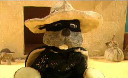
CHOCOLATE!!!!
We're doing a Cadburys brief at uni and I can't help but think of this from my childhood. It's the best opening titles sequence EVER in my opinion. That of which may be influence by my intense hunger right now having not eaten anything today and the face I've been staring at chocolate pictures all day!
Wednesday 24 April 2013
Advertising Strategies
The Volkswagen 'Drive Carefully' Campaign


I think the strategy here is, trying to communicate the importance of safe driving, through the use whit and through not using typical, 'over used' shock techniques. Using instances in life we can all identify with. If I go deeper into it I think the target audience are parent or at least people in their 30's & 40's who have some connection to children, because they've used accidents children have that will appeal to the parents emotions. I look at these and think they are slightly humorous which doesn't make me want to drive safely but I think a parent will look at this and their heart will go out to the child thinking of how they could have prevented such an accident. It's very cleaver and that it probably why it won in the D&Ad awards in 2012.
Credits: The Drive Safely campaign was developed at DDB Argentina, Buenos Aires, by executive creative directors Hernán Jáuregui and Pablo Batlle, creative directors Fernando Tchechenistky and Lisandro Grandal, art director Alejandro Hara, copywriter Emilio Yacón, and account manager Cecilia King.
Tuesday 16 April 2013
ITAP - My Design Hero - Philippe Starck.

My chosen design hero is Philippe Starck, the inspirational French product designer. You can find my presentation link below.
Click here to view my presentation.
Monday 25 March 2013
ITAP - Steph Parker - Design Heroes: Alfred Leete.
Alfred Leete, a British Graphic Artist, famous for the image below, was an illustrator from a young age, having had a cartoon published at age 16. He then worked in a printers workshop before going on to do his own work. I do not really like this image that much, I think it's lacking boldness and colour. The man looks very condescending and i feel as though i'm being told to do something I dont want to do rather than being motivated into action. I think the text is a little too illegible for a poster design, for a poster i think the whole message needs to be legible rather than just one word. Finally I think the positioning is not aligned correctly. I do not like how the arm is cropped and the face looks a little off centre to me.

I prefer the work Leete did for the London Underground back in the early 1900's I think they're very cleaver and the style in wich they have been done is one that I particularly like. The reliance on wit and humour is what makes these adverts. I don't know whether he was the writer for these ads but he certainly has designed for the text with great care and sensitivity to the message.


The war poster design was copied in 1917 by the American artist James Montgomery Flagg for the US army and I think it's a better version for a number of reasons. Firstly I think the colour makes it much more eye catching and somewhat more believable. The colours also are more patriotic, it's mainly red white and blue, so this may subconsciously evoke patriotism in the viewers. I think the position of the subject is a more personal one, by that I mean it doesn't look as much as the other one that he is looking down his nose at you and pointing as you, he is more staring at you into your eyes and asking you rather than telling you. The YOU being in red also highlights the personal aspect of this image. It makes it about me the viewer.

Friday 15 March 2013
ITAP - Design Heroes: Tim Allen.
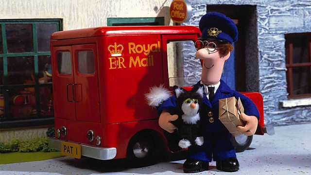
Tim Allen himself gave this lecture as we joined the animation students to hear him talk of how he got started in the animation business and some highs and some lows of working in the industry. It was very interesting to hear what he had to say about working professionally and the pressures that are put on you as an animator. Tim works solely in the field of stop motion animation, an area I am fairly interested in, it was great to listen to the man who was the main animator on some of my favourite kids TV shows. El Nombre, Fireman Sam, Postman Pat


My personal favourite claymation TV show on earth is Creature Comforts which Tim Allen worked on too! I love the accuracy of the human characteristics portrayed through the clay animals and often with hilarious audio recordings the animation compliments and enhances them excellently!

Tim gave us some good advice during the talk,
- Keep a record of all your work.
He said this so that you always have a record of where you have come from, the progression of your work and your style. Also you have a good bank of work to show agencies and clients when trying to secure a job.
- By 'just doing it', you gain experience and have a lot of opportunity to practice and inevitably you get better.
I wholeheartedly agree with this one, the more you do the better you get at doing. Practice makes perfect. There are loads of cliche phrases for a reason, it's the truth. The more i practice drawing and freehand typography the better i become at it!
- When putting together a showreel (we can translate this to portfolio) put your best work at the begging to grab their attention and then your best at the end, to leave them with a good feeling at the end, wanting more.
This is obviously a very helpful tip, i will have to find out weather it is true for graphic portfolios too but I think it sounds like a pretty sound piece of advice.
From Tim's talk I gained knowledge of a different field which is always useful, I was inspired to get out there and just DO more. He gave me a down-to-earth insight into what the real creative world is like and it was very refreshing to hear.
Tuesday 12 March 2013
ITAP - David Osbaldestin - Design Heroes: SO ME
David Osbaldestin gave a great talk talking about the links between fine art and design and he spoke of over 10 of his design heroes. The first designer he spoke about was the one he focused on more.
SO ME, real name Bertrand Lagros de Langeron, a french designer and animator who is also the art director for Ed Banger Records. Bertand is a self confessed part animal, he says that has best ideas come when hungover or on the road "so partying abroad is perfect" for him he told Surface to Air in a 2012 interview. Although from a Graphic Design background he spends most time in film making now, having made music videos for Kanye West, Kid Cudi, Justice, DJ Mehdi and MGMT. He also directs music videos and recently directed the music video for the 'Duck Sauce' song, "Barbra Streisand".
SO ME's video for the french electro duo Justice, friends of so me, incorporates hand drawn type that has links to Vernacular Typography (Lettering in the urban environment) the verity of type design is impressive and the composition on some of the T-shirts with more text is great. Here are some examples of Vernacular Type that remind me of SO ME's work.


I had a go at one of my own type designs using my initials. And in the process I learnt that it's not as easy as it looks to get it exactly right. I'm not very happy with this rushed attempt and I think I would have to do more by hand with pen and paper rather than simply using illustrator.

This video was a huge success and possibly landed him the job to do Kanye West's "Good Life" video after SO ME got his attention by creating this spoof cover of the artwork of the song that beat Kanye at the EMA awards when Kanye stormed the stage declaring that his video cost $1,000,000.

SO ME, real name Bertrand Lagros de Langeron, a french designer and animator who is also the art director for Ed Banger Records. Bertand is a self confessed part animal, he says that has best ideas come when hungover or on the road "so partying abroad is perfect" for him he told Surface to Air in a 2012 interview. Although from a Graphic Design background he spends most time in film making now, having made music videos for Kanye West, Kid Cudi, Justice, DJ Mehdi and MGMT. He also directs music videos and recently directed the music video for the 'Duck Sauce' song, "Barbra Streisand".
SO ME's video for the french electro duo Justice, friends of so me, incorporates hand drawn type that has links to Vernacular Typography (Lettering in the urban environment) the verity of type design is impressive and the composition on some of the T-shirts with more text is great. Here are some examples of Vernacular Type that remind me of SO ME's work.
(these 4 images are taken from http://vernaculartypography.com/)

This video was a huge success and possibly landed him the job to do Kanye West's "Good Life" video after SO ME got his attention by creating this spoof cover of the artwork of the song that beat Kanye at the EMA awards when Kanye stormed the stage declaring that his video cost $1,000,000.
http://www.bbc.co.uk/collective/dnaimages/gallery/2/edbanger/2.jpg
These kind of bold acts are those that get you noticed and get you recognition along side good work. We can learn from SO ME here, his ability to respond so quickly to an event like this is great.
Subscribe to:
Posts (Atom)