Monday, 26 November 2012

ITAP - The Design Workflow & The Experts

I have chosen to write about the design workflow and the section titled The Experts.

1. The Design Workflow
This is my design workflow. At frist glance it looks like not a lot and yes it is simple BUT there is a lot of thought in this workflow system. It took me a while to pin point exactly what process i go though when i work, but i narrowed it down to these 6 simple steps that reach the ultimate goal of final product. I know too that i can be lazy and miss a few of these out and this often tends to be the work i am not proud of. I think at any stage of review or analysis there is the potential for you to start all over again or at least go back to the work stage of my chart and start from square one. Also after a final review you may find that you need to go back to the development stage to develop your original idea in a different way. I find this works for me and i think i could use this model to teach others with potentially too.

2. The Experts
My favourite expert is Stefan Sagmeister wo said:

“most current graphic design  done by professional 
design companies is used to promote or sell, which is fine, but 
design can do so much more”

I agree a lot with the quote, i am sometimes disheartened when i find people using their skills purely for commercial means. I feel as though those people are withholding something from the rest of us, it's great to use your skills to try and sell something but i think there are other things just as important as making money which require design.

Sagemeister's typographic work proves this for me;

His collection of 'life quotes' done in this very interesting form show how he is willing to put so much effort into something that yes may have been put into a book or a gallery and he may have made some money off it but in his TED talk he explained how this series was born out of a list of truths he had learnt over the course of his life. It was stuff that made him happy not purely driven to make money. And that is why i like Stefan Sagmeister the best, because he brings real life into his work and he isn't always driven by money rather a pure love for the subject.


Wednesday, 21 November 2012

ITAP - Interpretation & Platform


The two principles i have chosen to write about this week are Principle 1 and 2, Interpretation and Delivery.

Interpretation
The Zeitgeist being the spirit of the age, I am going to look at an example of how this has affected art.


         Francisco De Zurbaran, Crucifixion              Piss Christ, Andres Serrano


Taking the crucifixion of Jesus Christ, a scene that has been depicted by many over the centuries, and choosing just two versions of it I can make some very interesting observations. The first image, Zurbaran's Crucifixion, was painted in 1627 in catholic spain. Zurbaran was a himself a catholic and I think this really shows in his painting of the crucifixion  Jesus in the Christian & Catholic faith is the central figure, the Lord and Saviour of their lives, so as a catholic Zurbaran would be sure to paint Jesus in a good light (literally speaking!). You can see that Jesus has a strong looking physique, he looks strong despite his disposition. The detail on his stomach shows ab muscles and his skin is very clean with no sign of blood from the flogging that Jesus received before hand. 


This is a more accurate depiction of what someone would look like after receiving the kind of torture that Jesus did, which is historically recorded.

He has painted Jesus with respect and admiration influenced by the strong religious culture of his day. Compare this with Adres Serrano's Piss Christ and it couldn't be further apart. Piss Christ completely disrespects Jesus, the Crucifixion and Christianity itself. Such a bold statement of having Jesus submerged in urine really shows the views and opinions of people of the 1980's. In the 80's there were a lot of public failures with big Christian TV evangelists, people caught in adultery and TV stations found out as being huge money scams. This teamed with the continuation of the free thinking movement of the 70's where people began to think about how they didn't have to believe in God, they didn't have to listen to what the Church was telling them anymore. A lack of disrespect and a sense of not caring about the sacred figure of Jesus Christ is prevalent in this depiction.

The culture of the times, the spirit of the age, the Zeitgeist is easy to see in any piece of art once you have a look at surrounding issues and themes of a particular date.


Delivery/Platform

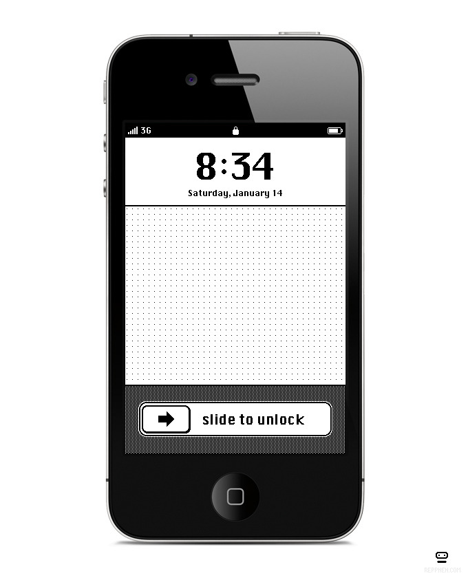
Anton Repponen is a creative director, designer, illustrator, product designer, photographer, t-shirt designer and much more. He obviously does work across a variety of platforms and I think he does this with particular elegance and skill. Designing apps, websites, socks, iPhone IOS themes, online map tools he is a great example of a designer who is making the most of many different platforms and doing very well at it too.