Friday, 14 December 2012

ITAP - Text and Image

This week we have the chance to write about any principle we think relates to the subjet matter that our lecture was about. Text and Image is obviously a very huge subject so I will be writing about the use of text and image in moving image for example motion typography.


This video uses text in a very cleaver way, employing simple techniques that work well with the chosen audio track. The most effective thing about this use of Text and Image is that timing of the animation along with the audio track, another example of when the audio track is very important is this video by Sebastian Baptista.

Make it better from Sebastianbap on Vimeo.


An example of motion or kinetic typograhy that is not relient on sound for it's effect is this:


There is a soundtrack to this video but there is not sound effects for the movement of the words or letters, the others all rely heavily on the sound to give it that 'UMPH!' but this one does not. This video is an informative video about the specific typeface Futura, it is very clean, crisp and clear in it's delivery of the information it is providing. Without the innovative use of text in this video it would not be successful. Nobody wants to watch a video with text scrolling down the page as if it was some 'Galaxy Far Far Away' nonsense. They keep it quick and fast paces without it being too jittery and they showcase the font for the beauty that it is.

This is an example of very bad kinetic typography.
It is not very imaginative, and it's not well synced.

I can concluse the text is very important to image in a vast number of scenarios, weather it is selling a product or entertaining an audience or conveying an emotive message, text is vitally important for all. Not only the presence of text but the use of that text is important too, they way in which the text is animated in these examples is key to the success of the video.

Monday, 26 November 2012

ITAP - The Design Workflow & The Experts

I have chosen to write about the design workflow and the section titled The Experts.

1. The Design Workflow
This is my design workflow. At frist glance it looks like not a lot and yes it is simple BUT there is a lot of thought in this workflow system. It took me a while to pin point exactly what process i go though when i work, but i narrowed it down to these 6 simple steps that reach the ultimate goal of final product. I know too that i can be lazy and miss a few of these out and this often tends to be the work i am not proud of. I think at any stage of review or analysis there is the potential for you to start all over again or at least go back to the work stage of my chart and start from square one. Also after a final review you may find that you need to go back to the development stage to develop your original idea in a different way. I find this works for me and i think i could use this model to teach others with potentially too.

2. The Experts
My favourite expert is Stefan Sagmeister wo said:

“most current graphic design  done by professional 
design companies is used to promote or sell, which is fine, but 
design can do so much more”

I agree a lot with the quote, i am sometimes disheartened when i find people using their skills purely for commercial means. I feel as though those people are withholding something from the rest of us, it's great to use your skills to try and sell something but i think there are other things just as important as making money which require design.

Sagemeister's typographic work proves this for me;

His collection of 'life quotes' done in this very interesting form show how he is willing to put so much effort into something that yes may have been put into a book or a gallery and he may have made some money off it but in his TED talk he explained how this series was born out of a list of truths he had learnt over the course of his life. It was stuff that made him happy not purely driven to make money. And that is why i like Stefan Sagmeister the best, because he brings real life into his work and he isn't always driven by money rather a pure love for the subject.


Wednesday, 21 November 2012

ITAP - Interpretation & Platform


The two principles i have chosen to write about this week are Principle 1 and 2, Interpretation and Delivery.

Interpretation
The Zeitgeist being the spirit of the age, I am going to look at an example of how this has affected art.


         Francisco De Zurbaran, Crucifixion              Piss Christ, Andres Serrano


Taking the crucifixion of Jesus Christ, a scene that has been depicted by many over the centuries, and choosing just two versions of it I can make some very interesting observations. The first image, Zurbaran's Crucifixion, was painted in 1627 in catholic spain. Zurbaran was a himself a catholic and I think this really shows in his painting of the crucifixion  Jesus in the Christian & Catholic faith is the central figure, the Lord and Saviour of their lives, so as a catholic Zurbaran would be sure to paint Jesus in a good light (literally speaking!). You can see that Jesus has a strong looking physique, he looks strong despite his disposition. The detail on his stomach shows ab muscles and his skin is very clean with no sign of blood from the flogging that Jesus received before hand. 


This is a more accurate depiction of what someone would look like after receiving the kind of torture that Jesus did, which is historically recorded.

He has painted Jesus with respect and admiration influenced by the strong religious culture of his day. Compare this with Adres Serrano's Piss Christ and it couldn't be further apart. Piss Christ completely disrespects Jesus, the Crucifixion and Christianity itself. Such a bold statement of having Jesus submerged in urine really shows the views and opinions of people of the 1980's. In the 80's there were a lot of public failures with big Christian TV evangelists, people caught in adultery and TV stations found out as being huge money scams. This teamed with the continuation of the free thinking movement of the 70's where people began to think about how they didn't have to believe in God, they didn't have to listen to what the Church was telling them anymore. A lack of disrespect and a sense of not caring about the sacred figure of Jesus Christ is prevalent in this depiction.

The culture of the times, the spirit of the age, the Zeitgeist is easy to see in any piece of art once you have a look at surrounding issues and themes of a particular date.


Delivery/Platform

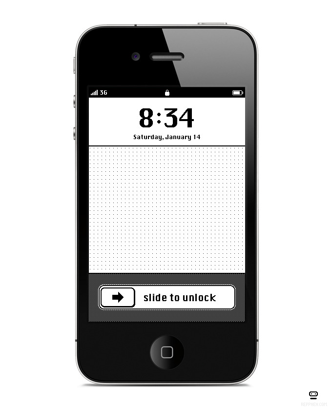
Anton Repponen is a creative director, designer, illustrator, product designer, photographer, t-shirt designer and much more. He obviously does work across a variety of platforms and I think he does this with particular elegance and skill. Designing apps, websites, socks, iPhone IOS themes, online map tools he is a great example of a designer who is making the most of many different platforms and doing very well at it too.

Wednesday, 31 October 2012

ITAP - Three Act Structure & Developing Narrative


the two principles i am about to write about are not conventional principles relating to design but i do believe that you can make links anywhere so i hope to do so in the following post.

1. The Three Act Structure
This is the simple notion that every narrative has a beginning, middle and an end. Another way to put it is that there is always equilibrium, disequilibrium and equilibrium within a story. And finally a more detailed view of this principle shows us that in these 3 acts there are various common occurrences that make up the acts these are; act 1: setup, inciting incident, act 2: rising action, climax, act 3: falling, resolution.

When i try to apply this to photography or graphic design it is difficult to think of how a photograph can have a beginning middle and end, but i do think that a photograph tells a story. partly i think that a photograph can be any one of the three acts, and i think it is then up to the photographer make sure the photograph is an accurate depiction of the particular act in the story.


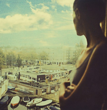
In this photo for example (the first image i came across on the website, ffffound.com) we see a girl looking out onto a boat dock, maybe a quayside and she had her arms folded. she is out of focus and her face is turned away. i can instantly think of a few different stories to go with the image, perhaps it is the start of a new day and she is looking out onto what her world beholds, this could easily be act one. equally it could be mid afternoon judging by the blue sky with some fairly established clouds forms floating, she could have returned home from a traumatic incident, she has her face turned away from us, maybe we are a character and she is deliberately looking away from us, she could be contemplating jumping from the window to escape the pain of life, everything is up in the air and nothing is certain for her, this is could well be act 2 with disequilibrium. or finally she could have just finished a task, a quest, she may have returned home and she is looking out on what she has not seen in a long time, normal life, her normal view. this could be act 3, resolution.

  1. Developing Narrative
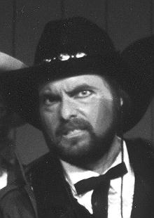
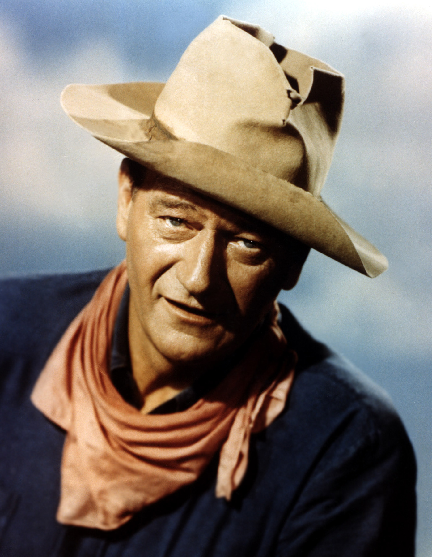
in all stories there are certain characters that fit into this principle, Kelvin talked about how there is always a protagonist and an antagonist. In simple story telling there is a ‘goody’ and a ‘baddy’, a hero and a villain. In the early western films there was always a hero cowboy who wore a white hat and then a villain in a black hat.


This was a very simple way of depicting the characters. nowadays you can have a hero in dark clothes and the opposite. this makes the naravtive more complex and interesting.


for example here the villain wears light clothing, and the hero is a ‘devil’ character so this adds to the narrative, and shows how narratives have developed since the early days of traditional story telling. 

Tuesday, 30 October 2012

ITAP ~ Legibility and Visual Hierarchy


In this past lecture in our Integrated Theory and Practice series we were given a talk about Visual Vocabulary. As always there were 5 key principles, the two of which I will be speaking about are: Legibility and Visual Hierarchy.

 ~ Legibility
In these three examples  i am unsure as to whether they display good legibility or not. If you were to simply look at these images on the internet, then i do not think they are easily read. the text is smaal, and in somewhat a seemingly un structured format (image three). But as you can see these are images of publications that were created for print production, which changed everything. When you have something in your hand you can bring it closer to be able to read it better but that is not the point is it. If something is deigned so that you need to bring to book/page closer then is is poorly designed in my opinion, but even still i think having these publications physically in your hand makes a difference. Depending on the size of the publication i think these are legible despite first impressions. If these were to be any smaller than an approximate A4 size then i think you would have trouble reading them. So to conclude my small study on legibility; 

The context of the image (web/print/screen) is important in analysing weather something is legible.

It is important to know the parameters in which the boundaries for legibility are set (size of publication/type of paper it's printed on/finish of the paper [gloss/matte]).

Here are some examples of good legibility:


- ~ -

 ~ Visual Hierarchy
These three examples show how in visual communication and design there is always a visual hierarchy. The Geography text book has a bold title located at the top of the page (but i don't think the location is the most important factor) and it stands out on the page. Your eye is drawn there first and you read the title and are immediately informed as to what the book is about. In the image of the watch, the aperture on the camera, controlling the depth of field, brings our attention to the watch itself, not the text on the page that it's on or the page behind but the watch. You look at the watch face first then your eye may wonder around looking at it's setting and perhaps the buckle which is out of focus. This is a technique that would be great for advertising, if this was an advert for a watch then you would be looking exactly at what the designer wants you to look at.

For example;
You can see how the focus of this image is vital in the understanding of the advert. when the watch is blurred you can't help but assume the watch is not the most important thing in the image, you look at the bits of the image that are sharp. In the 1st image where the watch is sharp it makes for a pretty good advert for IWC swiss watches.


Monday, 22 October 2012

ITAP - Research and Inspiration


In this weeks ITAP lecture I learnt about Research, Practice, Visual Vocabulary, Inspiration and Audience. The 2 of these ‘principles’ I am choosing to talk about are Research and Inspiration.

Primary and Secondary Research, Visual Research, Collecting and analyzing information, research is made up of different ways of gathering information. It can range from a very formal method of collating data by use of questionnaires, surveys, recording data patterns, but it also can be done visually, this is what is more important to me as a visual communicator. Visual research ranges from, sketching, photographing, videoing, collecting images anything that helps you get towards your destination, by that I mean things that help you, inspire you, give you knowledge of the subject field you are researching. As mentioned there is primary and secondary research, primary being research that you have collected yourself, sketches, your own photographs or videos, even questionnaires. Things like other peoples videos, photo’s, images, data that has already been collected, that is secondary research. Both are relevant but you cannot go one one or the other. For example I may want to research people in Birmginham, so I decide to sit for a day and sketch the people, but I may only see fat old people all day. This is not a fair representation of people in birmingham so I need to look at other peoples studies of people in Birmingham to get a fair and true representation of  the people here. These things all help you progress forward in your work, they provide you with a head full of knowledge regarding your chosen field of interest which prepares you to engage fully with the project you’re working on in a more dynamic and fresh way. Linked closely with research, you could almost call part of what I would consider looking for inspiration, Secondary Research. Frank Gehry once said, “You can look anywhere and find inspiration.” (Frank Gehry) And I agree I can look at an illustration and be inspired to draw. I can also see something in nature and be inspired to draw. I hear a song and be inspired to make a video to go along with it. In our lecture we were told, that inspiration is based on research, observation and recording and experimentation. I fully agree with this statement, as i have said, i think inspiration and research are very closely linked! So as i go on to research i hope to be inspired and as i am inspired i hope to be thrust into more research.

Wednesday, 17 October 2012

stop motion tests

this is the first stop motion test i did, using photoshop and after effects.


this was created using my iphone and a tonne of clicks with capture roughly 2/3 photo's per second on my journey home from uni one day.

Doing these tests is really helping me learn more about the art of animation/stop motion and also inspiring new ideas for our own work.